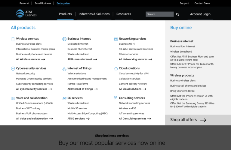
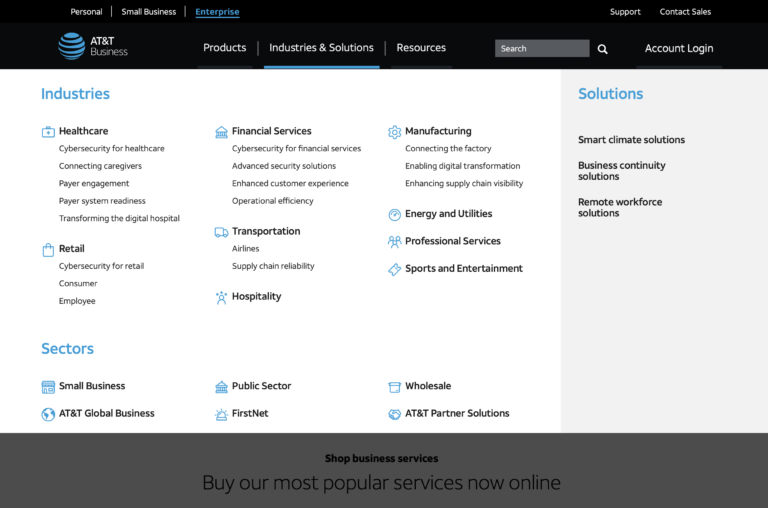
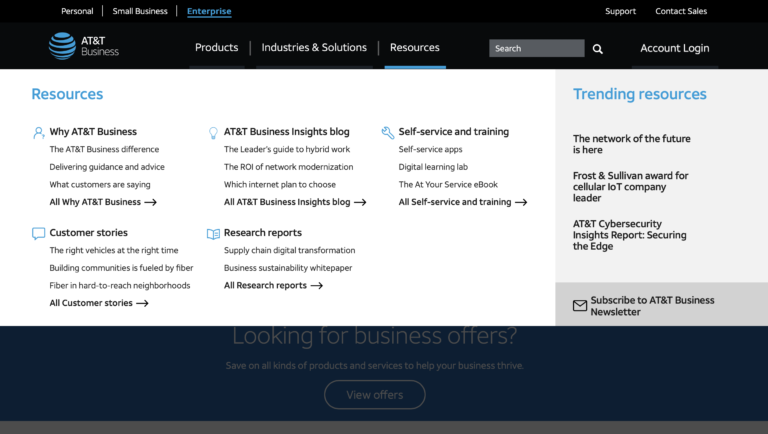
Navigation Re-design
AT&T Business
AT&T Business is an AT&T website dedicated a wide range of telecommunications, connectivity, and security offerings tailored to different business needs.
As a UX designer collaborating with a multidisciplinary team, I was tasked with redesigning the navigation with the primary goals of enhancing user experience, increasing accessibility, and ultimately drive higher engagement and conversion rates.
My role: UX/UI Designer
Key team members:
- Priyanka Sharma – Information Architect
- Rebekah Knapp – UX Researcher
- Aisha Bowers – Design Lead
- Rob Duncan – A/B Testing
- Zach Doty – SEO Lead
- Jennifer Rosetta – Development Lead
Challenge
In today’s fast-paced digital landscape, seamless navigation is pivotal for user engagement and satisfaction, helping to guide and orient new and returning users to a business’s products and services.
For quite some time, AT&T Business’ navigation was a sore spot for many stakeholders. However, it wasn’t until data compiled from multiple analytics, survey feedback, and tracking tools over the course of several months proved that it just as unsatisfactory for users.
Highlights from the initial exploratory research included:
- – Users clicking through navigation several times before eventually using search
- – Surveys detailing frustrations finding useful and meaning information
- – Time spent with the navigation open before ultimately exiting the site
From a UX perspective, the pressing problems boiled down to the following:
- – The number of levels of information
- – A reliance on hovering to reveal multiple levels of information, if that information even existed
- – When hovering, an inconsistent application of reveals depending on the level. For example, Explore (Level 1) and Products (Level 2) revealed information below each other (vertically), while subsequent levels revealed information to the side (horizontally)
- – Vague and sometimes misleading labeling
- – Although technically contrast compliant, the readability was low, partially due to the size and weight of the font.
Ultimately, we needed to significantly overall design to reduce frustrations and increase ease of use.
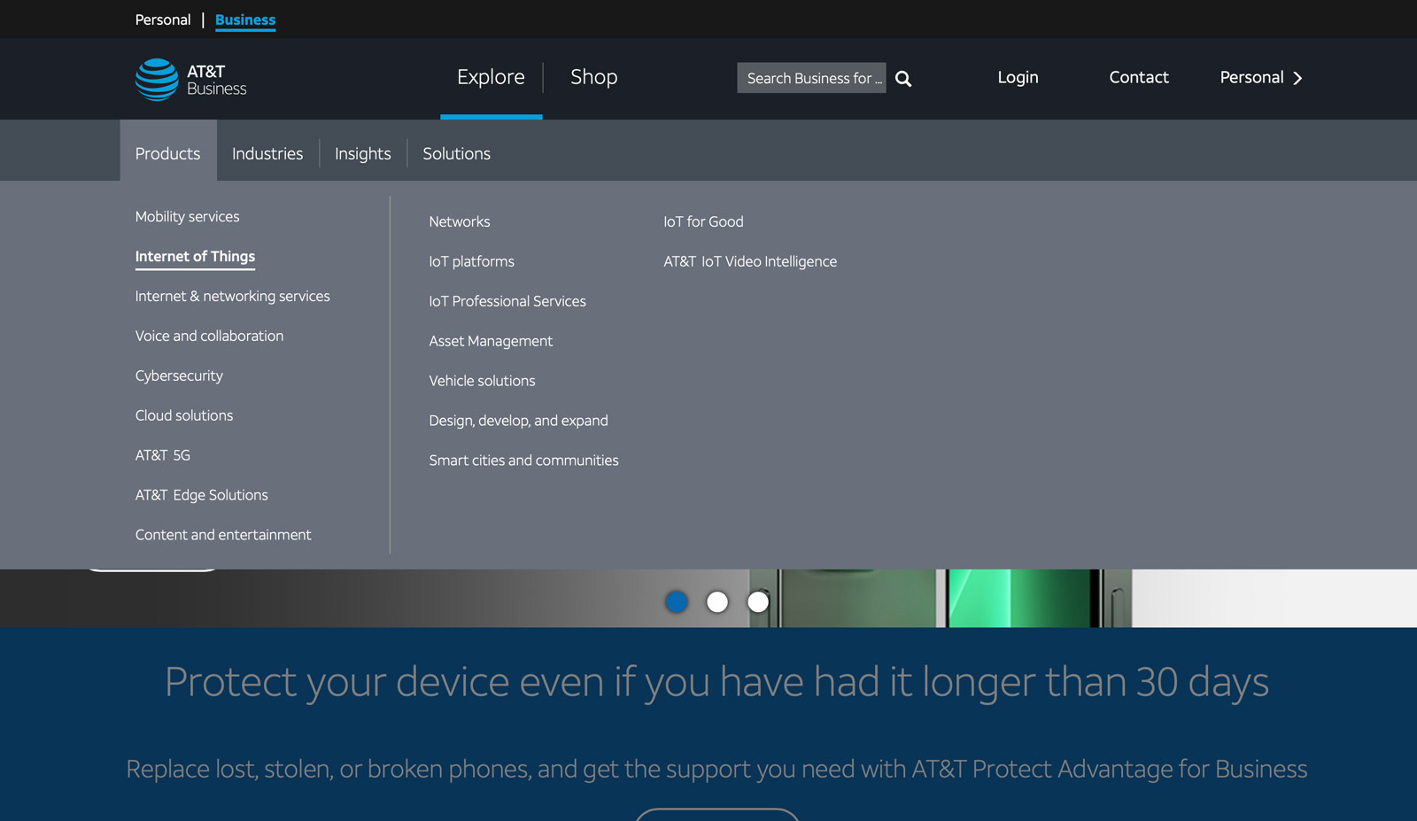
Comparative Research and Ideation
One of the biggest challenges for re-designing the navigation was that AT&T was the volume of products and services. At the time, there were at least 144 distinct products and services, five times as many resources, not to mention the pages dedicated to various sectors and industries of the market. Most were not and should not be represented in the navigation.
I performed an initial comparative analysis, focusing on other large tech companies. Within several websites, I found a pattern that was confirmed by additional research.
All sites used some version of a mega menu.
As a potential solution for our needs, it made sense. Rather than the current dropdown menu with its mix of vertical and horizontal flyouts, a mega menu would result in a more straightforward view while reducing the amount of hovering and clicks.
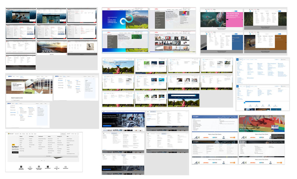
After deciding on an initial design direction, I set about creating wireframes.
I worked with the information architect to take the opportunity to explore other ways to re-organize the navigation based on different criteria. For example, since AT&T served customers with as few as several employees or small businesses, mid-market, as well as enterprises.
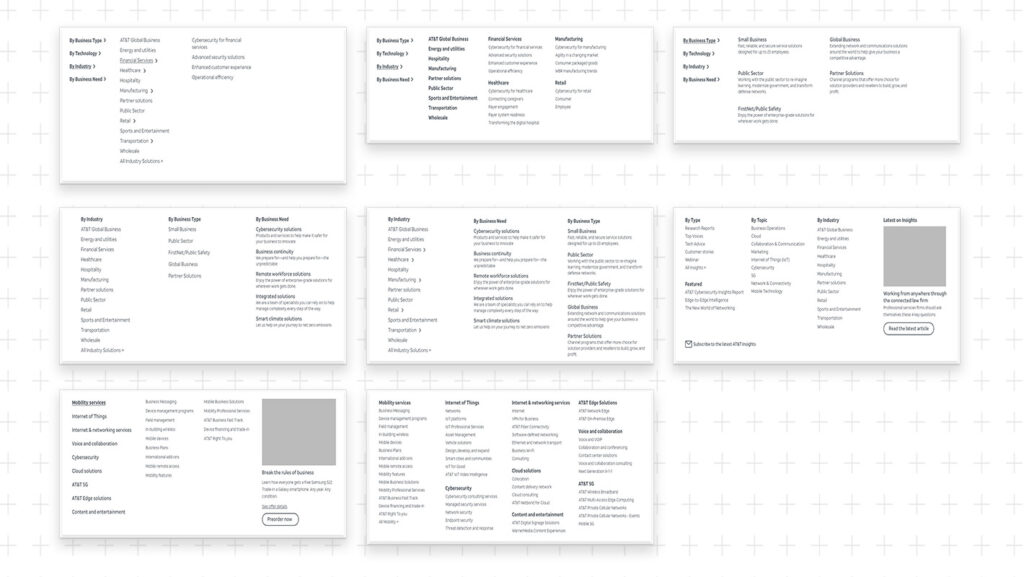
Based off of internal stakeholder feedback, the initial explorations were narrowed down to two. Visual elements were applied to align with design at the time, then presented in user testing by the UX Researcher.
Testing and Implementation
Based off of internal stakeholder feedback, the initial explorations were narrowed down to two. Visual elements were applied to align with design at the time, then presented in user testing by the UX Researcher.

We tested against a number of parameters from a labeling and design perspective, including:
- – What users expected to find under each primary navigation label (ie. Products, Solutions, Buy, Resources)
- – Degree of helpfulness of the ad/image
- – Left versus Top product headings
By overwhelming majority, the users preferred option B due to its simplicity and clarity.
After applying visual elements following AT&T’s updated branding, converting it to an interactive wireframe, the designs were presented to and approved by broader leadership.
We did several rounds of additional small group user testing with the branded high-fidelity prototyping but this time focused on positioning and new labeling that incorporated insights from SEO.

Once tweaked and refined, we then performed A/B testing with the old design to gather more quantifiable results on a larger scale.
Because many returning users had been accustomed to using the search in lieu of the menu, it took several weeks to acquire meaningful data.
There was a severe reduction in complaints about the menu and people seemed to find what they were looking for much faster.
With the positive response from internal stakeholders bolstered by data, the new menu was built and launched.
